I am driven by a simple question:
Why do people want what they want?
I’m a strategic and curious creative with a strong interest in consumer behaviour and how audiences emotionally connect with brands and experiences.
Studying BA(Hons)Fashion Communication and Promotion has shaped my approach to think beyond aesthetics, focusing instead on insight-led strategy, experimentation, and creating meaningful, joyful interactions.
As I complete my degree, I’m ready to apply my strategic thinking to the creative industries, shaping impactful, insight-driven experiences..
This brief tested our skills in creating editorial content to connect a chosen brand to its audience. A key part was to create entertaining, shareable and engaging content that tells a story at a cultural, emotional, and personal value level to make the individual a shared part of the brand world.
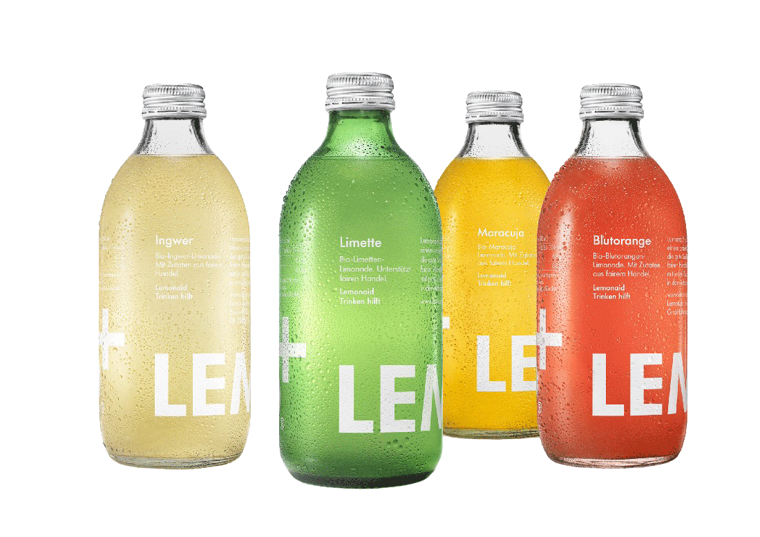
I chose the drinks brand LemonAID+ as I wanted to dabble into the food and drink world. Through trend research, consumer research and extensive brand research I identified the creation of LemonAID+’s very own festival as being the best strategic move.


Dropbydropfestival
#
Dropbydropfestival #

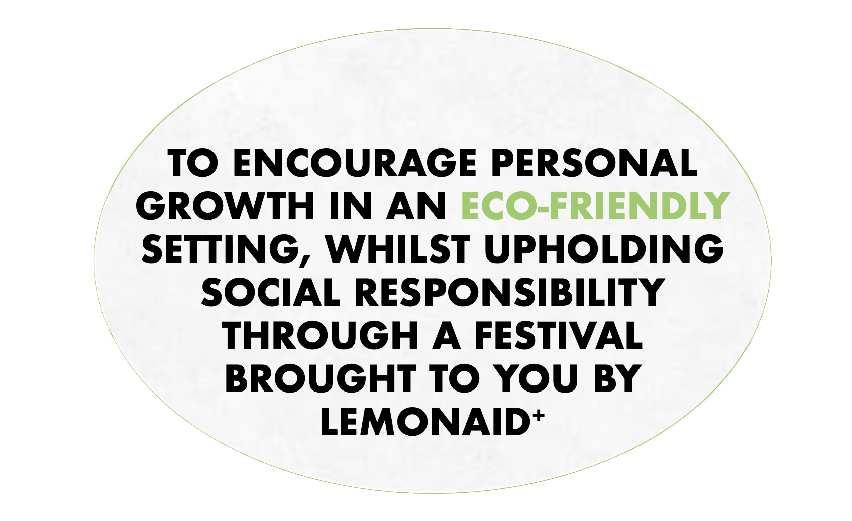


Each element of the festival has been carefully chosen to align with the brands values, whilst incorporating trends found through LS:N Global and WGSN. The age of my consumer is between 18-35 so each design choice has been made with that in mind. All outcomes were designed with the drinks flavours in mind. LEMONAID+ has a very subtle branding design so relies soley on the vibrancy and quality of their products to attract customer attention. Each stage is named using a drinks theme to create some fun while at the event.
From my degree projects, this has been one of my favourites I have completed due to my love for the festival scene and passion for analysing trends and consumer behaviour.


CONTEXT: Brand, Trend and Consumer Findings and Insights

Live Client BRief
*
Live Client BRief *
Team Live CLient brief


The Lookbook
〰️
The Lookbook 〰️


Overall, this project taught me the importance of networking, team work and the power of a good image. The quality of the photographs is what made our look book and captured our concept perfectly, bringing the idea to life visually. The use of texture, layering and subtitles compliments the imagery and models nicely while conveying the idea of rivalry in a subtle yet powerful way.
If I were to repeat this project I would ensure deeper research into the consumer was undertaken to make sure as a team we were depicting our outcomes to them, not just to please the brand.
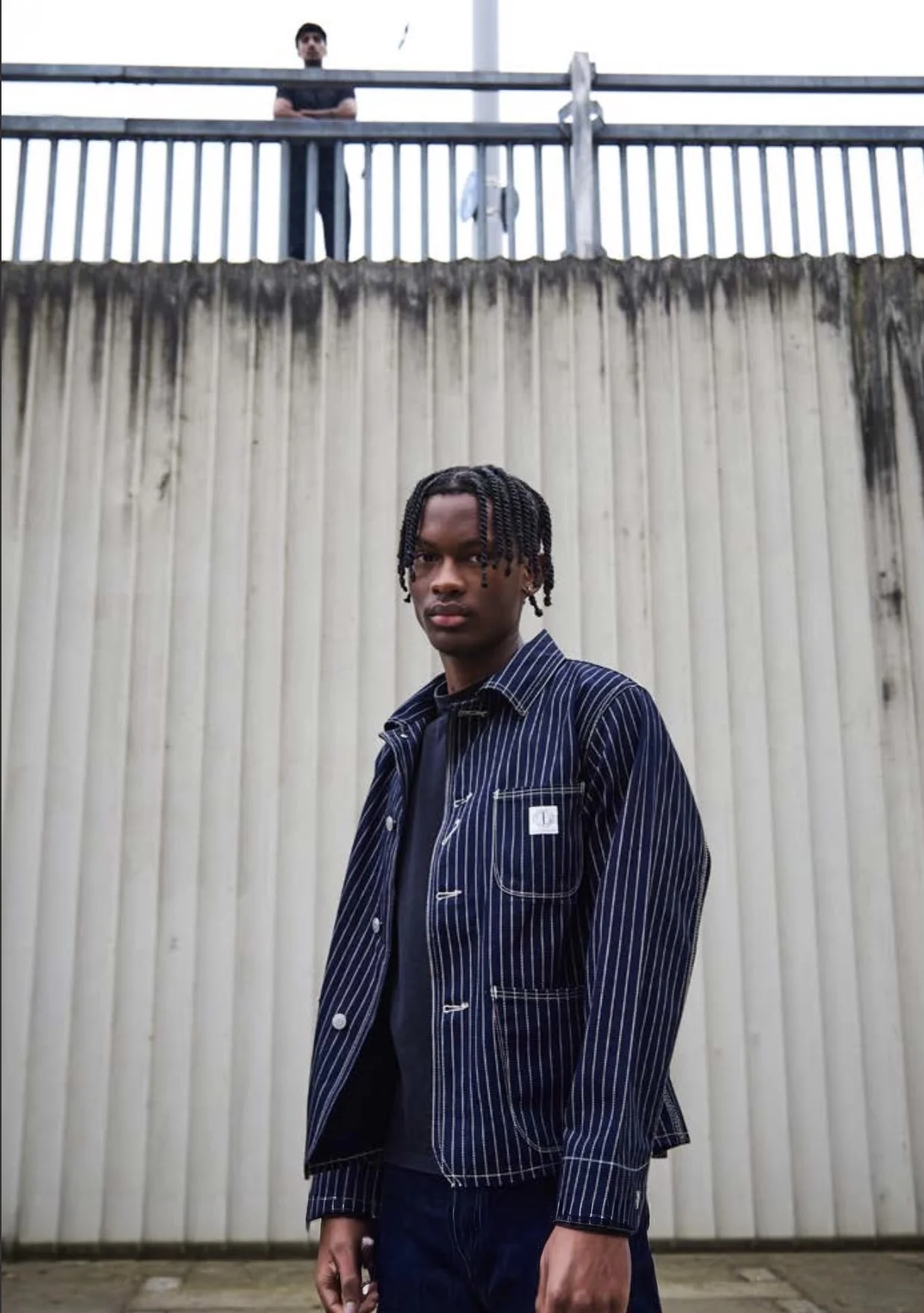
For this brief Dawson Denim requested a look book that showed off the cultural heritage of their brand as well as the craftsmanship and sustainability, whilst depicting our given theme.
To achieve this we pulled techniques from Hollywood films that we discovered during primary research, such as:subtitles, film agency logo, a clear storyline and film-style credits at the end. This draws in the nostalgia and association with Hollywood films for our target consumer, hopefully reminding them of their youth.
Furthermore, our primary concept was the rivalry within West Side Story so we prioritised location shots that reflected scenes from moments of tension within the film and chose models that could ‘act’ while posing. This made it much simpler to capture images that conveyed animosity between characters.


Creative directors: Lottie Goff & Maddie Booth
Models: Harry & Xhanti
Photographer: Freddie Rapp

Visual Report
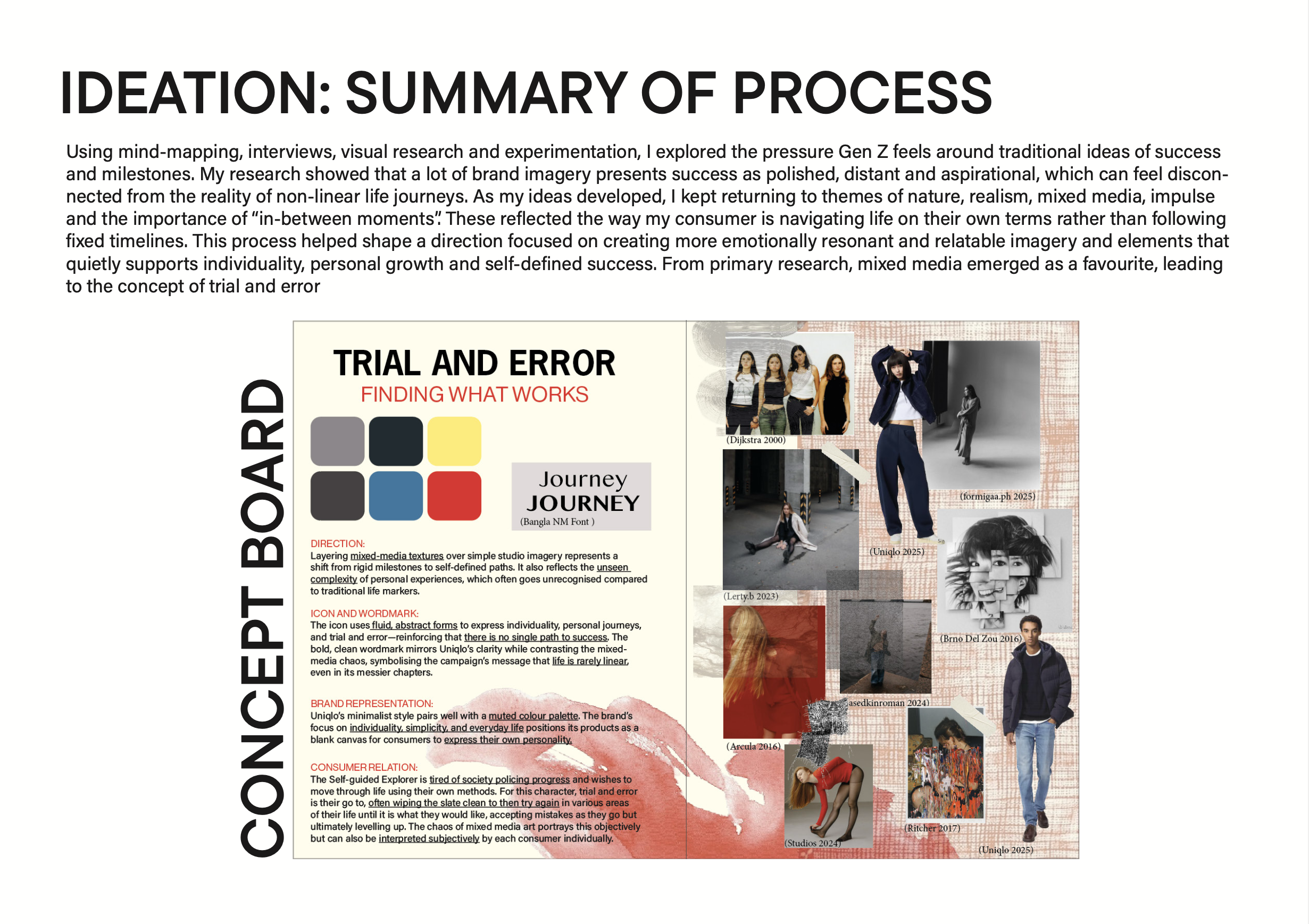
Timeline Not Found explores how shifting generational values are reshaping consumer expectations and engagement, analysing how fashion brands must adapt their content and advertising strategies to communicate reassurance, emotional resonance, and cultural relevance within Gen Z’s changing relationship to progress and success.When tackling this project, I focused mainly on primary and secondary research ensuring the results underpinned every decision I made. Alongside this, I carried out various prototypes and tests to ensure that the outcomes of my findings matched my consumers needs and wants correctly, leading to a strategically viable report. My feedback stated that my report was well-researched and thought-provoking, with poetic and contemplative outcomes that align strongly with my chosen brand (Uniqlo) and current life trends.


This project challenged me to step out of my comfort zone in more ways than one. My outcomes represented the motion of trial and error which i related to mixed media art. This meant i had to experiment with various art skills and conduct trial and error myself. It showed to me the importance of collaboration as well as the value of iterative testing and following the FCP process when producing findings and insights. Overall, this project allowed me to delve deeper into my love for consumer behaviour and therefore the strategy relating to that, showcasing my learnt abilities throughout my 3 years of study. Finally, Timeline Not found allowed me to answer my favourite question ‘why do people want what they want?’.
Contact me for the full pdf!


Final concept board:Decided based on primary feedback

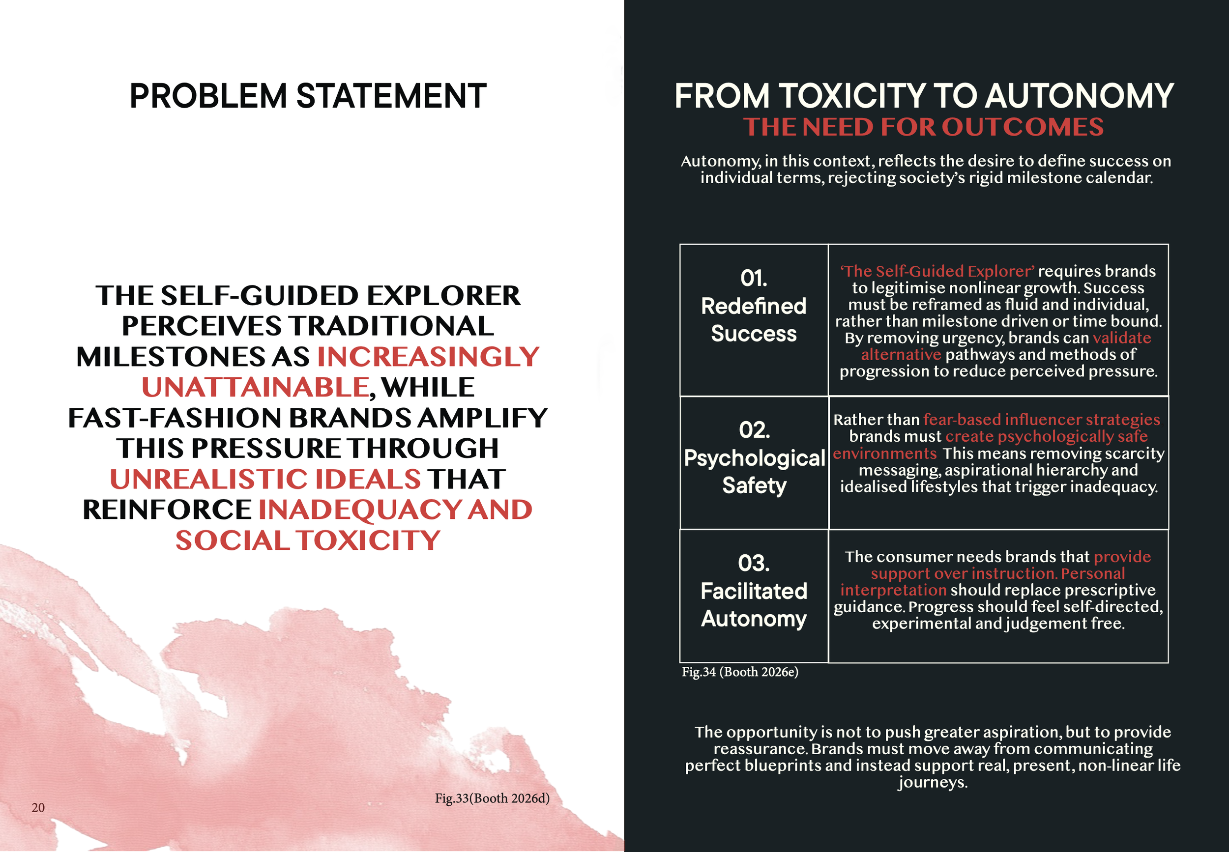
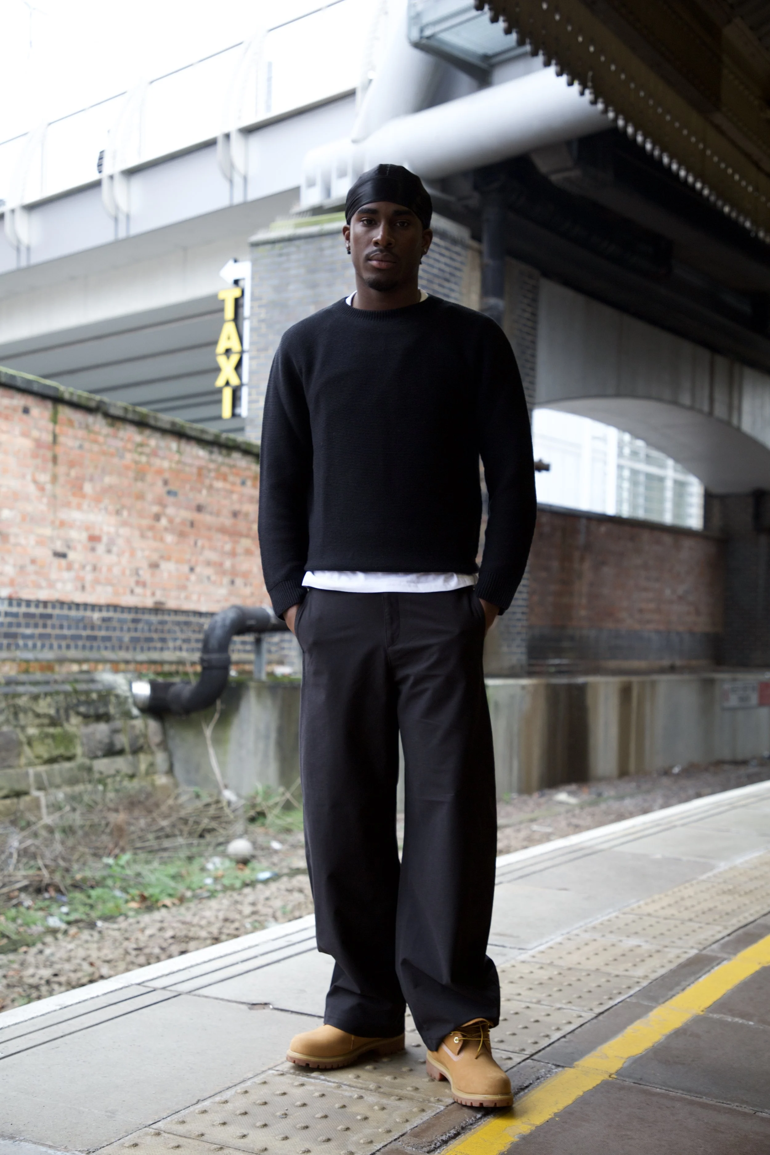
Trial and Error is a campaign developed in response to the changing relationship Generation Z has with traditional life milestones such as buying a house, starting a family and getting their dream job before they turn 30. The project began through research into chrono-normativity, post-pandemic socio-economic and political uncertainty, the pandemic skip and the increasing pressure experienced online through influencer culture and fear-based marketing. With the rise of ultra-fast fashion creating constant demand for newness, that pressure is often passed from brands directly onto consumers, contributing to feelings of anxiety, comparison, and social toxicity.
Using UNIQLO as the chosen brand context, Trial and Error explores a quiet, reassuring and honest approach to fashion communication. The campaign celebrates the idea that people do not need to have everything figured out immediately and that failure, experimentation, and uncertainty are all part of growth.
This was communicated through a series of mixed-media outcomes that combine visual storytelling, art direction and digital campaign elements inspired by real emotions and experiences within Gen Z culture gathered through primary research.
Rather than projecting perfection and a blueprint to life, the project focuses on reassurance and emotional connection, creating a campaign that feels relatable, reflective and relevant to current conversations within the fashion industry.
Lifewear Zine


The limited-edition zine serves as the campaign’s main outcome, translating the Big Idea into a tactile format. In contrast to high volume digital marketing, it prioritises reflection, intimacy and longevity. Designed to be kept, the zine deepens engagement and reinforces the campaigns commitment to meaningful connection.
It is designed to provide a lasting emotional connection, positioning Uniqlo as a supportive presence rather than an aspirational authority. Through its simple content, it encourages repeated engagement with the publication and associated digital and OOH touch-points.
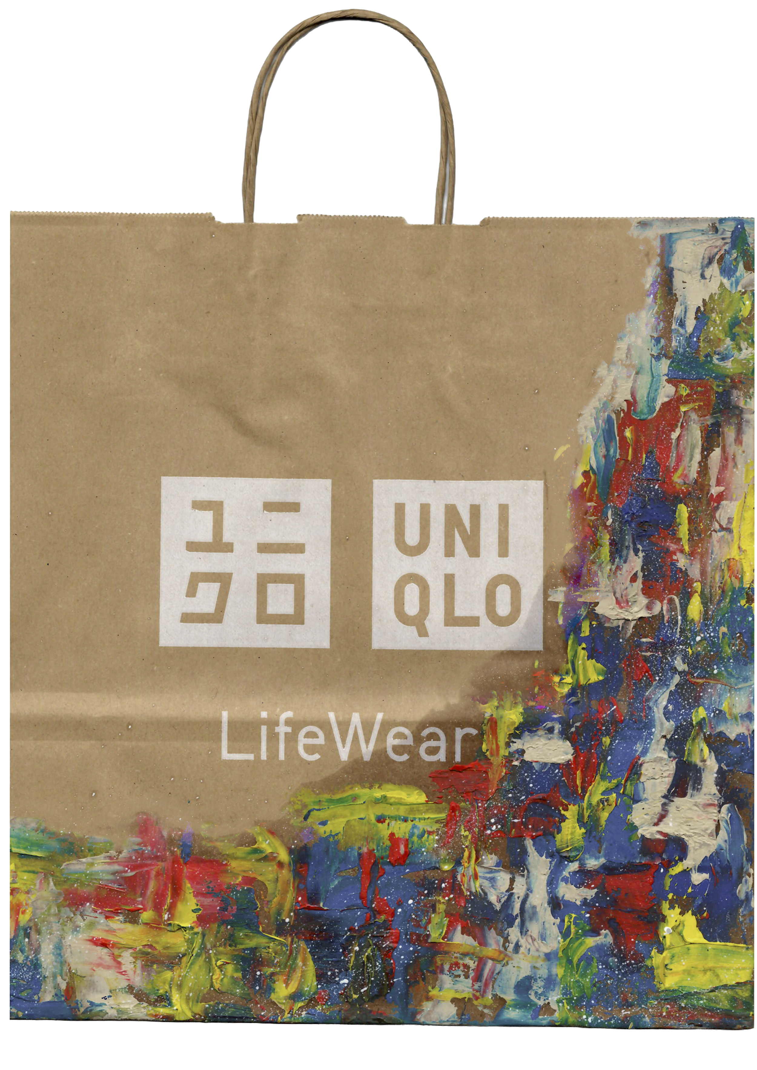
Designed Carrier Bag
posters


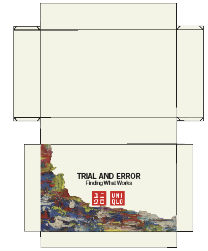
PR & Customer Engagement Box

Inspiration


Wes
Anderson
Style
Wes Anderson style filming became a rising trend on social media platforms, in particular TikTok in 2023. Above are screenshots from popular videos inspired by the trend. For our film, we felt as a group that the style and mood of these Wes Anderson clips was the best fit for what we were trying to compose. However, Wes Anderson films are often bold with colour which for our short film wouldn’t be appropriate as it wouldn’t suit the lonely and ‘out of place’ vibe we are wanting to convey. Wes Anderson films have a focal point (in our case our model Rio and his orange jumper), and they have still backgrounds with movement from people and natural surroundings(in our case this will be the backdrop of the busy city).

DUTCH ORANGELOCATIONS


Film SynopsisIn this film, the colour orange becomes a symbolic representation of stagnation and the struggle to find one’s place. Our chosen model, Rio, consistently wears an orange jumper, reflecting his emotional state as he navigates the routines of everyday life.
Despite engaging in mundane activities, there’s a sense of feeling out of place.
The film strategically unfolds in the evening, utilising dark lights and hues to convey the profound loneliness that envelops Rio. This deliberate choice in setting, coupled with the use of pathetic fallacy, aligns the weather with Rio’s emotional turmoil.
Filming at night serves a dual purpose: it accentuates Rio’s orange sweater, making it a poignant focal point, and emphasises his sense of isolation, particularly as those around him wear darker colours.
The film weaves elements of contrast, portraying Rio’s lonely emotions through subtle body language and actions against the bustling backdrop of the city. This deliberate juxtaposition adds depth to the narrative, highlighting Rio’s internal conflict within the dynamic and busy environment.
Submissions:
GFW Communication and Promotion Portfolio
GFW Digital Media Campaign
WEARECREATIVESNTU
GFW Portfolio


Image 3


GFW digital media campaign


Wearecreatives ntu submission
Hero Image
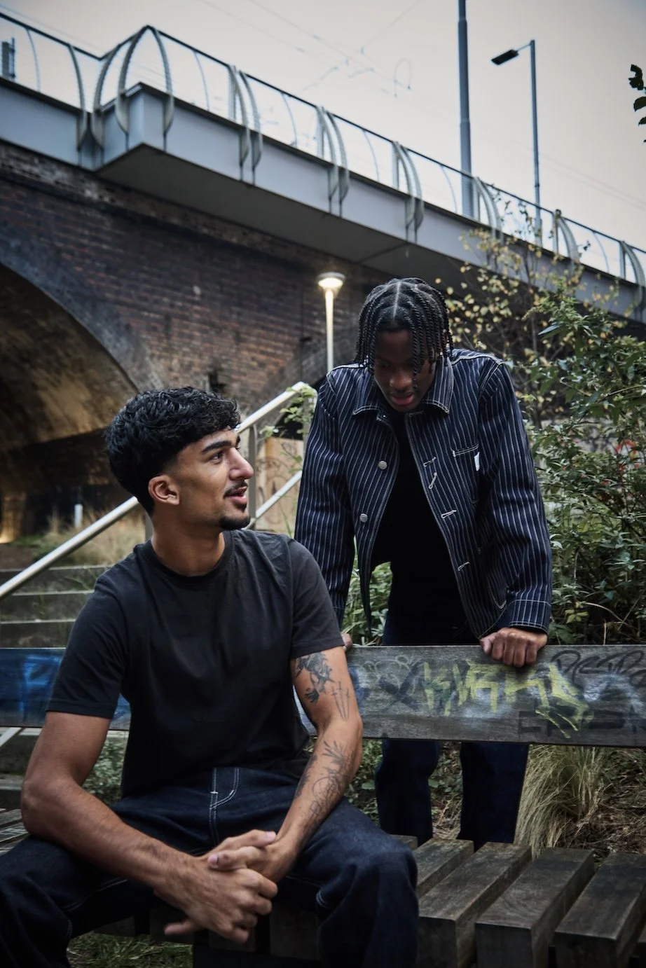
Image 4


Image 1

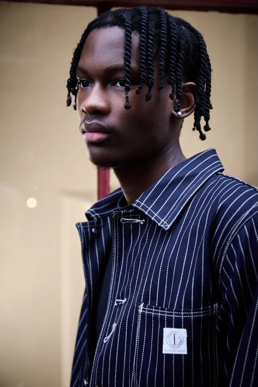
Image 2
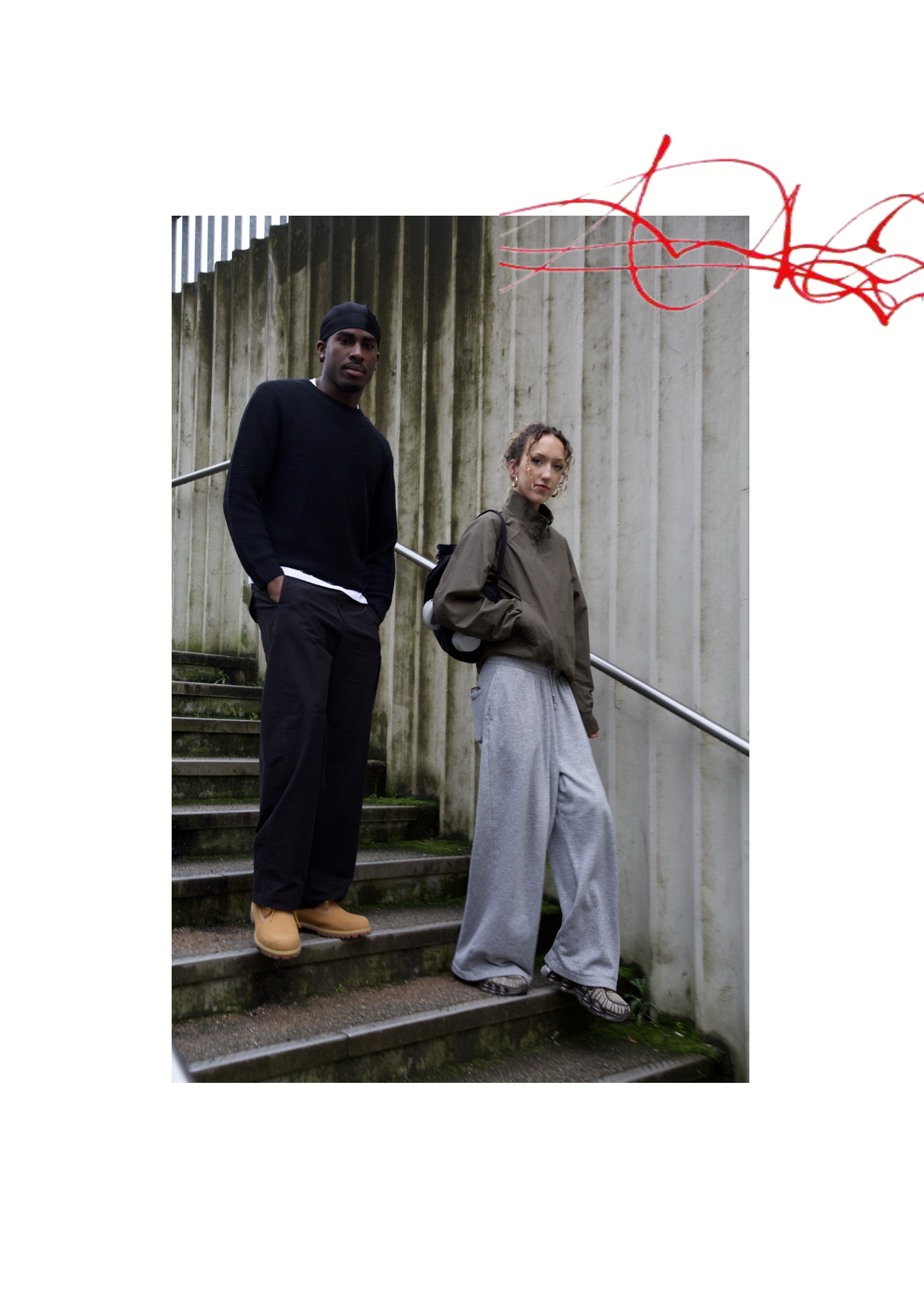
Image 5